Who

we are

we create
we create
we promote
we love
brands
websites
companies
what we do
WE CREATE
brands
WE CREATE
websites
WE PROMOTE
companies
WE LOVE
what we do

Robot is a multi-talented, award-winning digital marketing agency with expertise in classic and emerging communication channels. We craft personalized experiences based on sound strategy, and execute with precision. Not only do we think outside the box, we design the box. Full spectrum communications, marketing and technology: the robots are coming, but don't worry - we're here to help.

Our

Showreel

Take a look
at our work

Our

Portfolio

Newfoundland Rogues Branding
Tacora Resources Photography
Tacora Resources Website Mockup
NL Egg Farmers BillBoard
NL Egg Farmers Photography
NL Egg Farmers Website Mockup
Orangestore digital ad
Oceanic Cannabis Branding
Oceanic Cannabis Tradeshow
Oceanic Cannabis Logo Branding
Copsys Branding
Copsys Branding
Copsys Website Mockup
AdventureSmart Website Mockup
Everwind Print
Everwind Print
Everwind Rendering
Everwind Rendering
Everwind Tradeshow
Ocean Holyrood Initiative Tradeshow
OceansAdvance Tradeshow
AdventureSmart tradeshow material
A chef looking up at the camera surrounded by spices
EVOO Pizza
Gypsy Tea Room Logo
The St. John's Fish Exchange logo burnt into a table surrounded by ingredients
Pango Isometric Cut-away
Another chef looking up at the camera surrounded by spices
Safe Or All in Banner
Website for Ned Pratt
Safe or All-in promotion on a gas station pump
Safe or All-in promotion on a trash can
A view of the sjfx dinning room
Safe or All-in promotion on a gas station pump
Rutter Tradeshow Banner
Oceanic Releaf Website
A female St. John's Fish Exchange server on christmas
A female chef fileting a large fish with a machette in the ocean wash
A male chef in the ocean wash with a large fish over his shoulder
Fancy looking alcholic beverages
Oceanic Releaf Container Art
SJFX Front Page Promo
A logo of a robot with a broom
EVOO Spaghetti Logo
Evoo Logo
The Bigs Logo
A male chef standing on the shore by a table about to chop a fish
A male chef standing on the shore by a table
PanGeo Subsea Logo
A plate of fish and chips with peas
The robot logo on a blue and blue-green star-field with the heading Future Powered
A wonderful view of a dock in holyrood and the beautifuly wooded hill-side behind it
Holyrood Tradeshow Banner
A beautiful Holyrood bay surrounded by verdant hills
A robot in a tesla orbiting the earth
Gypsy Tea Room Dining Area
EVOO Logo
EVOO Logo
SJFX Lobster Dinner
A robot in a dress shirt at a desk surrounded by reports
A work shirt with the futureclean logo on the breast
Mothers day best wishes from futureclean
The futureclean fieldguide to muddy boot prints
A logo of a robot with a broom and a santa hat
SJFX Mac and Cheese
SJFX Authentic NL Decor
New years good wishes from futureclean
Futureclean robots having a grand ol day in the snow
A contrasting back/white logo with a simplified camera lens shape
The Robot Interactive robot on a casting couch surrounded by famous robots
PJ Billingtons Banner
A man sitting at a desk in a Ramada room
A nicely lit room with a soft bed and tasteful decour
A linework robot head on a blue/blue-green star-field
The robot logo in white on a yellow background of tiled robot heads
A happy valentine's day wish to all the lonely and not so lonely hearts out there
A black and white picture of a robot on middle cove beach with a vibrant red poppy attached to it
Chevron station All-in promotion design
A banner asking how detecting an oilspill early could change the outcome
A pamphlette on 3d seabed scanning
AdventureSmart pamphlette
Holyrood pamphlette
AdventureSmart promotion
The Bigs signage with an oddly ominous overcast sky
scroll

What

We Do

Everwind Logo - Green Scale

Holyrood Logo - Green Scale

Tacora Logo - Green Scale

OceansAdvance Logo - Green Scale

NL Jackpot Bingo Logo - Green Scale

AdventureSmart Logo - Green Scale

Chevron Logo - Green Scale

BridgeVUE Logo - Green Scale

TSN Logo - Green Scale

St. John's Fish Exchange Logo - Green Scale

Read More

Talk

To Us

If you would like to know more, discuss a possible project or simply say hi, feel free to drop us a line here.

Call

+1.844.ROBOT.IM762.6846 +1.709.738.0101

Follow

  • Facebook
  • Twitter
  • Instagram
  • YouTube

Snail mail

Robot Interactive + Marketing
PO Box 1506, Station C
St. John's NL A1C 5N8
Canada

Hours

Monday - Friday
9am - 6pm
  • About
  • Showreel
  • Portfolio
  • Case Studies
  • Contact
Robot Logo

+

The Exchange on Hollis

The Situation

The AdventureSmart program is a nation-wide federally funded outdoor awareness program aimed at reducing search and rescue incidents across Canada. It is administered by the Search and Rescue Volunteer Association of Canada, a coalition of 9,000 volunteers across 13 provinces and territories under the administration of the National Search and Rescue Secretariat and within the Government of Canadas Department of Public Safety. We have worked with SARVAC for a number of years, but our work on AdventureSmart specifically began a year ago, initially to help design a Trip Planning app. Because of the overwhelming success, we’re now rolling out new branding and creative for the program across Canada.

Our Approach
SARVAC’s challenge with the AdventureSmart program was to appeal to a wide variety of folks – from amateurs, to outdoor enthusiasts, to adventurers.
Creativity, communication, and in-depth research are three factors that help guide our approach at the beginning of every project. We began by looking at similar apps and the companies that created them and identified the pros and cons to each app, and how we could improve on their positive aspects while dismissing the negative. We then conducted research with potential users to understand what they valued most in an app. Guided by this, we created a variety of potential art-styles and promo campaigns. After presenting the different styles and campaigns to the AdventureSmart team, we integrated their feedback into our approach and produced a signature illustrated style to which anyone could relate, with a design that would reflect the values of AdventureSmart itself. We created a full suite of custom illustrations to carry through the app itself as well as the launch campaign. In addition, we created an animated launch video to introduce the country to this app and life-saving features.
The Results

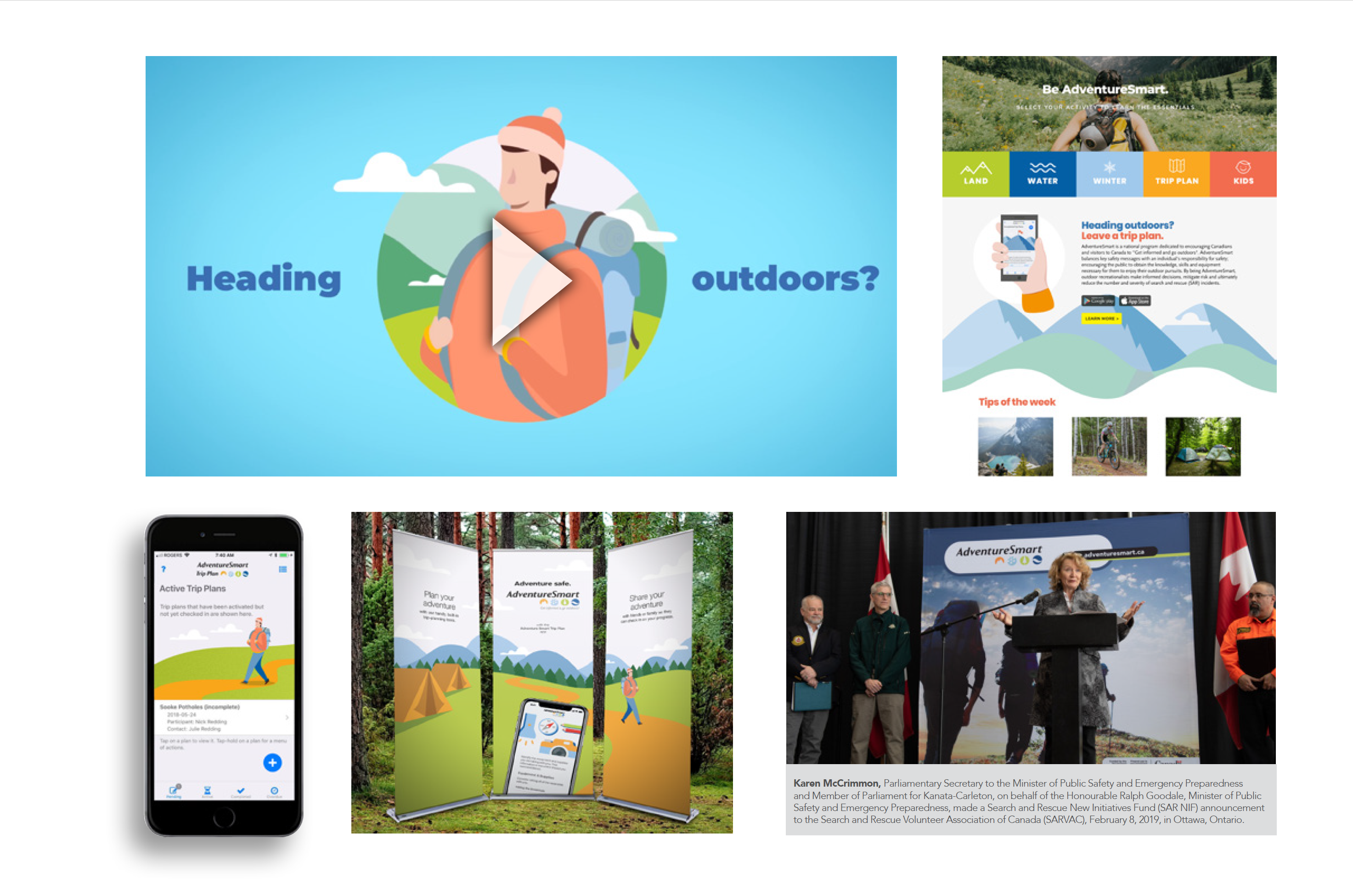
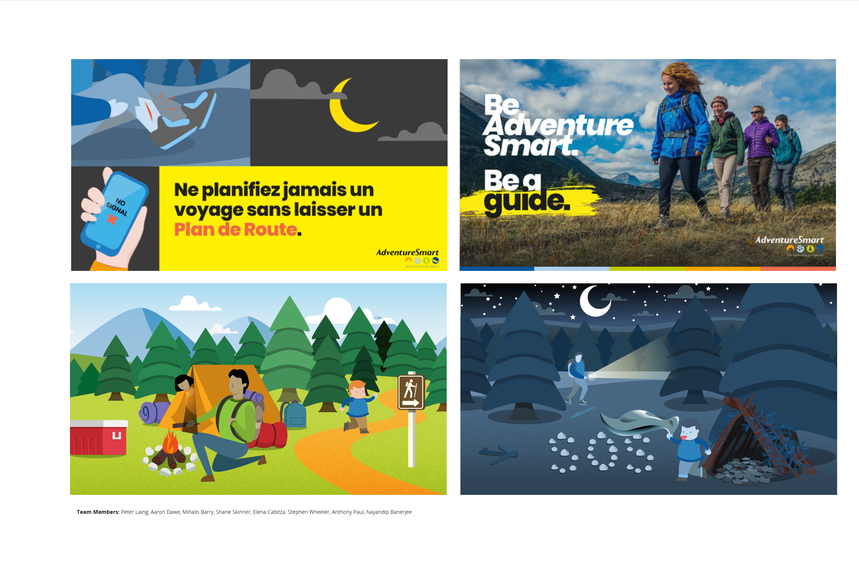
The client was thrilled with our work on the Trip Plan app, as well as the national launch campaign. The app was announced at a media event in Ottawa in 2019 and has since received national recognition and the Department of Public Safety could not be happier. On the strength of this success, we have completed a comprehensive national rebrand of the AdventureSmart program, extending the style we have developed into a new suite of promo materials, a new website, and an E-Learning program.

“The AdventureSmart app saved a life in Western Canada when a hiker broke her leg and rescue personnel were able to locate her using the trip plan produced through the app. The app works, and it saves lives!”


- Paul French, National Prevention Coordinator


The Situation

The AdventureSmart program is a nation-wide federally funded outdoor awareness program aimed at reducing search and rescue incidents across Canada. It is administered by the Search and Rescue Volunteer Association of Canada, a coalition of 9,000 volunteers across 13 provinces and territories under the administration of the National Search and Rescue Secretariat and within the Government of Canada’s Department of Public Safety. We have worked with SARVAC for a number of years, but our work on AdventureSmart specifically began a year ago, initially to help design a Trip Planning app. Because of the overwhelming success, we’re now rolling out new branding and creative for the program across Canada.

Our Approach
SARVAC’s challenge with the AdventureSmart program is to appeal to a wide variety of folks from amateurs, to outdoor enthusiasts, to adventurers. Our approach was to create a signature illustrated style that anyone could relate to.

We created a full suite of custom illustrations to carry through the app itself as well as the launch campaign. In addition, we created an animated launch video to introduce the country to this app and its life-saving features.

We also worked extensively with the SARVAC team to ensure the Trip Plan app conformed to Canadian accessibility guidelines and provided an improved, intuitive user interface and user experience.

The Results

The client was thrilled with our work on the Trip Plan app, as well as the National launch campaign. The app was announced a media event in Ottawa on February 8th, 2019. Since its launch the app has enjoyed a 5 star rating in both the Apple App Store and Google Play Store and has received national recognition.More importantly; to date there have been numerous cases of lost Canadians who have been recovered as a direct result of the information used by the app. It works, and it has saved lives. We are now working through a full brand development project, along with an ambitious E-Learning program and the team at SARVAC (and the Dept. pf Public Safety) could not be happier.

The AdventureSmart app saved a life in Western Canada when a hiker broke her leg and rescue personnel were able to locate her using the trip plan produced through the app. The app works, and it saves lives!

Paul French, National Prevention Coordinator


The Situation

The largest restaurant group in Atlantic Canada a well-known local group — was reeling from the highly publicized failure of a bold original concept restaurant Legros & Motti European Kitchen. They needed a slam dunk to stop the bleeding and get their group back in the black.


Our Approach
When a restaurant space opened in the new 351 Water Street building, we went deep with the ownership group to research the area and worked hand in hand to develop their vision. Building on insights gained from our research (daily seafood specials were the best selling dishes at Legros & Motti, and hoteliers were telling us that their guests had no obvious destination for fresh local seafood), together, we hatched a stylish and modern restaurant concept, that also paid tribute to the historical fish trade that drew the first settlers.

Urban and hip with an authentic twist that hearkens back to the soul of the City, SJFX is a casual restaurant with great food and loads of atmosphere.

The modern industrial interior is punctuated with historic images of the waterfront fish trade, as well as vintage maps, local advertisements, and of course, a copy of the Encyclopedia of Newfoundland (we learned Joey Smallwood began that project from an office on the premises). The look and feel of the concept is rustic modern and design and photography all follow that style. We participated in all areas of the project, including compiling the prospectus, designing interior and signage, all menus, wall graphics, and general promotions.
The Results

This is an experienced restaurant team, one that oversaw the opening of many celebrated conceptsincluding the Keg St. John’s and Moncton. To a person, they all claim this has been the smoothest and most successful restaurant opening they’ve been a part of. Opening in the dead of winter and growing during whats now considered a recession, this restaurant continues to be the hottest ticket in town, and recently had their busiest week ever. Despite being half the size, they are currently beating the Keg St. John’s in sales every day of the week except for the weekend. A social media darling, the concept gets tremendous social interaction, and the website averages over 8,500 hits per month. Sales are much stronger than projected, and with the busy tourist season beginning, theres no let up in sight.


SJFX Mac and Cheese
An image named assets/cs/SJFX_FrontPage.jpg
❮

The Situation

Exacerbated by regional conflicts, the global shift towards sustainable energy has become a key focus of governments around the world. One of the most promising opportunities is Green Hydrogen – a safe, non-polluting combustible fuel that is created through sustainable energy processes like wind turbines. EverWind Fuels was one of the early companies jockeying for the opportunity to harness Atlantic Canada’s wind energy and create the world’s leading hydrogen production hub.

Our Approach
We worked closely with EverWind Fuels on the development of their land nomination submission, community engagement materials, and 500 page land bid submission. This included custom creative and messaging that spoke to the communities on the Burin Peninsula, as well as comprehensive illustrations and graphics to help communicate the strength of the EverWind approach.
The Results

Of all the proponents, EverWind has been the most successful *by far*. Their community engagement efforts resulted in letters of support from every single municipality on the Burin Peninsula, and virtually no public negative comments on the proposed project. Their land nomination was accepted, and they beat out 31 other applicants to be one of just four accepted land bids, and the only one on the Burin Peninsula. They are truly poised to be one of the leading global players in this nascent industry.


The Situation

In 2017 Tacora Resources purchased the Scully Mine in Labrador, and in 2021 purchased the Sydvaranger mine in northern Norway. Tacora specializes in revitalizing shuttered mines and turning them into profitable operations that become the heartbeat of the communities in which they operate. As a company, Tacora wanted to show the world that they produce high-quality and sustainable iron ore in jurisdictions that are progressive and forward-looking, all while becoming a part of the community fabric where they operate. To achieve this, they wanted a full website re- design - in English, French, and Norwegian - and an ambitious video campaign to be created to highlight their commitment, vision, and work opportunities.

Our Approach
We interviewed Tacora employees from varied backgrounds, across all departments. This gave us a feel for the company, its people, and its operations. We then deployed our production team to capture day-to-day operations across multiple locations in order to tell the story of how Tacora’s ore is discovered, mined, refined, and transported to market. This allowed us to showcase their product and bring able to bring a human aspect to their brand; the story told through the videos we crafted serves as a point of connection for anyone, so that even those who have no background in the mining industry can relate to and understand Tacora’s standards, methodology, and who they are as a company. Robot delivered a new website (scheduled for a Q4 launch), complete with new branding and unique graphics, charts, copy, and images and illustrations that would help anyone digest Tacora’s process, their service offerings, and what makes their product such high quality. Additionally, we have completed corporate videos, designed to showcase the inclusive work environment at Tacora, while subtly highlighting their impact on their employees and their communities. And we are currently working on a video series that will showcase the company’s values that have positioned them as a global leader in iron ore production and are set to release those videos, with an International media campaign, in early 2022.
The Results

Tacora has proven itself as a company that is both local and international. They’ve fostered immense goodwill with the people of the communities in which they operation. Tacora is seen to have breathed life into Wabush and Kirkenes, both of which were facing an uncertain and distressing future. They’ve proven themselves as trusted employers in a way that is sincere and reassuring. Tacora has also attracted more investors on a global scale and have ramped up their production, generating an impressive amount of revenue. Recruitment continues to grow each quarter, and Tacora continues to adapt and improve their approach through innovation, expansion, and sustainable practices.


The Situation

In Newfoundland and Labrador it is often difficult for municipalities to differentiate themselves, especially from an economic development perspective. The Marine Institute recognized that the Town of Holyrood’s harbour was uniquely suited to ocean research and established a facility there. With this major asset in place, the Town created the Oceans Holyrood Initiative (OHI) to help capitalize on this opportunity and create an ocean industry cluster for the region. After a few slow years, they recognized this initiative was not yet moving the needle, and went to RFP for a strategic promotional partner. They needed a fresh take on the OHI brand, promotional videos, website, a full suite of collateral, and most importantly, a communication strategy.

Our Approach
Towns in the province – and the province itself – trade heavily on its folksy charm and the culture of problem-solving that comes from living in a harsh climate. But more than that, we knew we needed to communicate a brand and vision that was progressive, modern, and innovative to attract real investment to the area. After conducting extensive market research, our design choices were bold and fresh; styled to appeal to a global audience of energetic change-makers. Through meeting with the stakeholders of the OHI, we were able to refresh the town’s tagline – “Come Ashore” – and adapt it as Where Ocean Innovation Comes Ashore.” This new tagline defines Holyrood as a place that appeals to a wide range of groups; from early-stage startups to global corporations, the OHI has become the regions economic driver for ocean innovation. We created an economic development strategy that leveraged Holyrood’s natural assets along with their world-class R&D facilities to position them as a global leader in the ocean economy, and the Town’s stated goal of creating its future became a call to innovators around the world: Create Your Future Here.
The Results

The campaign launched in Q1 of 2020 and featured a new website, updated content and information, a fresh communication strategy, modern trade show material design, and promo videos designed to sell Holyrood as the next hub for ocean innovation. The campaign was a great success and the energy that this project created continues to be felt. We did our homework, and due to our research we were able to lay a foundation that provided the OHI with a fresh, inspired approach to invigorate its efforts. The Town has seen a surge in interest from companies and organizations exploring and planning expansion into Holyrood - a direct result of our new communication strategy.


The Situation

Since 2017, the Government of Canada and the four Atlantic provinces have been working together on the Atlantic Trade and Investment Growth Strategy (ATIGS) to help position Atlantic Canada as a global leader in the knowledge-based ocean economy. As part of this initiative, eight partners of the ocean sector group came together to launch a project to unify Atlantic Canada’s positioning as a world ocean leader – including a holistic brand, video series and collateral.

Our Approach
We started by going deep on Atlantic Canada’s place in the global ocean marketplace, its natural and technological advantages, as well as Canada’s brand on the world stage. Our experience with ocean technology companies like Rutter, PanGeo Subsea, Kraken and SubC Imaging gave us a good starting point, while our work with the Oceans Holyrood Initiative and the Marine Institute provided perspective on the research and development ecosystem. Our branding built off the Canadian brand – incorporating an iconized red leaf – while adding an ocean wave and a broader colour palette. The brand articulated the idea that – like waves building upon each other – the industry here ecosystem was building upon itself. Technology was building on technology, innovation upon innovation, wave upon wave. We created three dynamic videos: an overview of the Atlantic Canada’s ocean industry advantages; a profile of the many technologies being created right here; and an outline of the ecosystem and assets. In order to speak to the largest group possible, we also created versions of each video in six languages.
The Results

This project and its videos were showcased at a recent national event – the Blue Economy Deep Dive, featuring guests from the Atlantic Canadian ocean industry, as well as Innovate Canada delegates. Received with applause and referenced continuously by the international panel, the team from OceansAdvance – who lead the project – have received nothing but praise from across the country, and excitement from its partners. The project is now being featured at trade shows around the globe.


The Situation

When the 180 Chevron stations in British Columbia decided to discontinue their loyalty program, they expected a consumer backlash. Their problem was simple: how do we keep our loyalty program-based clients a segment identified as 2% from leaving?

Our Approach
In cooperation with a local gaming partner, we developed a comprehensive in-store/out-of-store gamified promotional contest — starting with a concept built to work seamlessly with the Chevron brand. Our promotion was chosen over three proposals from their incumbent marketing firm — global giant Young Rubicam. The “Safe or All In” contest included in-store signage, as well as mass media digital and social media campaigns targeted to every community with a Chevron station. At the core of this promotion was a website and mobile app tied to a back office server that managed all aspects of player registration and gameplay.
The Results

Not only was Chevron able to keep the 2% of clients related to their loyalty programs, but they experienced an additional 3% lift in retail sales. The delta of 5% associated with this application is a huge number when considering sales over the contest period were in the 8-figure range. The Chevron Safe or All In application also managed to out-perform a similar program being executed nationally in the United States, and garnered significantly more app downloads in a fraction of the market size. In fact, the manager in charge of this campaign was given an impromptu standing ovation at a gathering of senior management because of its success.


The Situation

PanGeo Subsea has been around for 12 years, but the public, their market, and even we didnt understand what made their technology stand out. They felt their brand didnt didn’t stand out and their messaging was confusing.

Our Approach
We started with their core technology. They wanted to communicate that they were the only provider that was able to offer fully 3D sub-seabed images. With that in mind, we set out to establish a visual system that communicated the 3D” nature of PanGeo’s technology in a way that is easy to understand and interpret at a glance. Our creative design solution involved extracting a simplified 3D cutout of an ocean scene, presenting a visual cross section of the environment and data capture process. We further developed these “Pockets of Reality“ to provide a visual metaphor through which to understand different applications and different technologies – but the same fundamental idea: illuminating the sub-seabed.
The Results

PanGeo has had a breakthrough year, growing it’s staff by 400% and adding two new offices. In addition to a full new suite of stand-out marketing material, we helped them launch a new brand and logo that let’s the world know, this is a new PanGeo Subsea  a global leader in sub-seabed imaging.


The Situation

When the owners of the successful local branch of the Don Cherrys franchise decided to go out on their own withtheir own sports bar concept, the stakes couldnt have been higher. Creating a new, successful brand on the foundations of a beloved local institution ran the risk alienating long-time fans while failing to appeal to a new client base. Getting it right meant landing that knock-blow first try and handle the transition with style.

Our Approach

The client's goal with shifting away from Don Cherrys was not only to get out from under franchise fees that they felt were not being well invested, but to also support the restaurant worth a more comprehensive slate of promotions that appealed to a younger demographic. We broadened the appeal from the‘hockey-based’ brand of Don Cherry to embrace an approach that was more inclusive of a whole range of sports and live events. With that strategy in place, The Bigs’ – that is, ‘the big leagues’ in all sports was born.


A hockey hang-out now become a cool summer spot to catch a baseball game or spend your Sunday as part of the in-bar football betting pool. The ‘classic eat-in area of the restaurant stayed relatively the same for long-time fans, while the bar area got a hipper, younger make-over.

The Results

The Bigs managed to capture the majority of old customers by maintaining the element and menu items that appealed to that group, while updating the restaurant in ways that made it new. Now, rather than living and dying with the hockey season, the local Bigs restaurants have become top of mind as the destination for all sports


The Situation

When Rob Moore, Robert Decker and Chris Dunn decided to team up, they asked us to help them craft a brand that would stand-out in the market place. Real estate is a unique industry – the brokerage brands are the strongest, while the individual realtors attempt to create a presence for themselves.

Our Approach
With Moore Decker Dunn, we created something in between a strong local brand that wouldnt get lost in the noise the way national brands can, but had a stronger presence than individual realtors.
The Results

After five years, the results have been everything they hoped for and more. Moore Decker Dunns presence, positioning and success is the gold standard, both locally and regionally, for a stand-out real estate brand.

The Situation

With the rising cost of living, saturated charity landscape, and the increasing expectation of online purchasing ease in the digital world, a number of our local not-for- profit clients were looking to meet their fundraising and operational goals, while decreasing the need for elaborate logistical support for large-scale in person events. Our partners were looking to scale ticket-focused fundraising, and increase accountability measures.

Our Approach
Recognizing both our client’s changing needs and the shift in contemporary consumer behaviour, paired with the organizational benefits of introducing digital processes, Robot saw an opportunity to invest in modern, all-encompassing 50/50 software that streamlines online ticket sales, accepts a number of payment methods, easily integrates into online landing pages, and has highly organized back-end capabilities for an organization’s financial accountability requirements. Coupled with engaging creative awareness campaigns, we knew online 50/50 contests would help our clients meet their fundraising goals, while also ensuring more money could go directly to the organization’s mandate. At present, Robot is one of only two companies in Newfoundland and Labrador that have access to online 50/50 capabilities.
The Results

In just a few short years, our three main not-for-profit clients have been able to redirect available planning resources to areas where it’s most needed like programming and staffing, and together we have raised over 2 million dollars.


The Situation

TSN was looking for a cross-promotional opportunity to capitalize on the World Junior Hockey Championships their most most watched live sporting event.

Our Approach
Using ARKit, We developed a tabletop Augmented Reality hockey game that didnt require the use of visual markers, meaning it could be deployed on any surface. The game used swiping obstacle avoidance gestures and a fully developed 3D hockey stadium model.
The Results

TSN opted not to finish the game, however they were very impressed with the demo and the opportunities for A/R to enhance their broadcasts. With that in mind, they set up introductions for us with some of their key advertisers.


What is AR?
Augmented and Mixed Reality will change the way we interact with technology forever. The ability to contextualize data in real time, instead of reading from screens, has incredible potential for all aspects of the digital landscape. We recognized that our province’s most important sector the maritime industry  could find massive benefits from this technology, and we set out to develop a prototype to prove just that.
Our Approach
By enhancing human experience and judgement through easy to access, contextual data, we recognized that we could significantly reduce the chances of costly errors in judgement. From this realization, we developed the BridgeVUE Mixed Reality Decision Support system for maritime industries. This prototype was designed for the MS Hololens platform and developed to leverage data from another local maritime tech company Rutter’s sigma s6 radar processor. It mitigates risk, improves safety and enhances human judgement and experience.
The Results

While we are still in the development phase, initial response has been overwhelming. The offshore industry in this province sees massive potential in this systems ability to provide enhanced data in low visibility conditions. Further development will add new data inputs, more intuitive navigation and secondary views.